

Printed Long Pile Carpet Recommendations for a Stylish and Cozy Home
2026-09-19
Printed long pile carpets are the easiest way to make a room feel instantly warmer and more put-together—soft underfoot, yet bold enough to anchor your decor. I've sifted through the options that actually balance style and everyday durability, so you don't end up with a rug that sheds or flattens in a month. A few of these picks come with a nod from Senseco, whose eye for lasting home trends helped shape the list.
Plush Patterns That Make a Room Feel Instantly Warmer
There’s something about a room draped in soft, tactile patterns that instantly takes the chill out of the air. Think chunky cable knits thrown over an armchair, or a faded Persian rug whose worn edges invite bare feet. The secret isn’t in matching everything perfectly—it’s in layering textures that ask to be touched. A nubby boucle pillow beside a smooth linen throw creates a quiet argument between surfaces, and that tension is what makes a space feel lived-in rather than staged. You don’t need a roaring fire to feel warmth; you need patterns with depth enough to hold your gaze and soft enough to hold your weight.
Velvet gets all the credit, but the real workhorses of a cozy room are the smaller, overlooked patterns: herringbone wool on a footstool, waffle-weave cotton on a curtain, a hand-knotted loop pillow that catches the lamplight like a sweater. These aren’t loud statements. They whisper. A room filled with such details doesn’t demand attention, it simply settles around you. And that’s the trick—warmth comes from repetition and subtlety, not from a single oversized throw. Scatter a few textured pieces across the room, and suddenly the empty corner by the window feels like the best reading spot in the house.
What makes a plush pattern feel warm isn’t just the fiber; it’s the memory of old things. A quilt with a log cabin design stitched by hand, a wool kilim with a slightly uneven border, a chenille bedspread that’s softened after years of washings. New textiles can be cozy, but they lack that patina of use. If you want instant warmth, mix one or two heirloom pieces with newer, high-pile textures. The contrast between the old and the fresh keeps the room from feeling like a catalog photo. It feels like someone actually lives there, and that’s the warmest pattern of all.
Playing With Scale: Oversized Motifs vs. Tiny Repeats
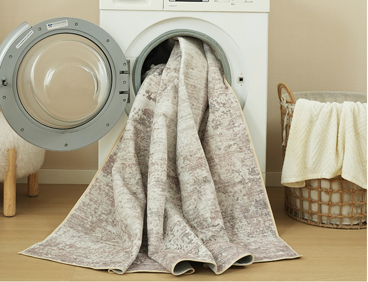
Scale isn't just a detail—it's the quiet engine of visual rhythm. Oversized motifs, whether they're blooming florals or geometric medallions, demand attention and turn a surface into a statement. They carve out negative space, making each repeat feel deliberate and unhurried. Tiny repeats, by contrast, work like texture: a fine grid of dots or a delicate sprig motif reads almost as a solid from a distance, but up close it reveals a meticulous, almost meditative precision.
The real magic happens when you let these two extremes collide. A wall of large-scale botanicals can anchor a room, while a narrow border of miniature checks or coin dots softens the transition to solid trim. Or flip it: a field of micro-florals feels airy and vintage, then a single oversized motif panel becomes the hero. The tension between the two scales keeps the eye moving, so the pattern never feels static or predictable.
One practical trick is to test scale at arm's length and from across the room. If an oversized motif looks blurry or a tiny repeat vanishes into noise, adjust the contrast or spacing rather than simply enlarging or shrinking the artwork. Remember that scale also changes with context—what feels bold on a pillow may read as subtle on a duvet, and a tiny repeat that's charming on a lampshade can turn chaotic on floor-to-ceiling curtains.
Pairing Printed Pile With Wood and Stone Textures
There’s a quiet friction that happens when a busy printed pile gets placed against a rough stone floor or a live-edge wood shelf. The pile’s pattern has motion, while the wood grain or stone veining holds a slower, geological stillness. That mismatch is exactly what makes the pairing feel intentional rather than decorated.
The trick is to let one surface keep the authority. If the pile is large-scale and graphic, keep the wood and stone pieces muted in tone but visible in texture—wire-brushed oak, honed travertine, maybe a chipped slate edge. Let the eye land on the print first, then wander over the quieter grain and fossil marks. The room doesn’t need everything shouting.
For smaller printed pile pieces, like a runner or a single chair cushion, the opposite works well. Here the wood and stone can take up more visual space, and the pile becomes the punctuation. A deep indigo or rust print against pale maple and warm limestone often reads as collected over time, not matched from a catalog.
Muting the Palette for a Calm, Collected Look
A room saturated with bright, competing colors can feel restless, as if every surface is vying for attention. Muting the palette strips away that noise by shifting hues toward softer, grayer, or earth-toned versions of themselves—think sage instead of kelly green, clay instead of cherry red, oat instead of canary yellow. The result is an atmosphere that doesn't shout but rather settles around you, making it easier to relax and let the eye rest without any jarring interruptions.
This approach works because desaturated tones share a common undertone, almost like they've been mixed with the same breath of fog or dust. When applied across walls, furniture, and textiles, these colors create a seamless flow from one area to the next, reducing visual boundaries and making a space feel larger and more cohesive. Even high-contrast combinations, such as a smoky plum next to a weathered brass, lose their harshness and instead read as thoughtful, layered choices.
To achieve the look without drifting into blandness, layer multiple muted tones with different depths—a pale chalky blue beside a deep charcoal olive, softened by natural linen and unfinished wood. Texture becomes the quiet hero here: a nubby wool throw, a matte ceramic vase, or a rough plaster wall can catch light in ways that flat, saturated colors never could. The overall effect is a collected, intentional calm that feels curated over time rather than decorated in a day.
Traffic Zones: Where a Dense Pile Earns Its Keep
Hallways, entryways, and the path between the sofa and the kitchen see more footfall in a week than a guest bedroom does in a year. That constant abrasion grinds down loose, airy fibers fast. A dense pile, with its tightly packed tufts, spreads the impact across a much larger surface area. Each step presses down on dozens of yarns instead of a handful, so no single thread bears the brunt. The result is a carpet that holds its shape and color long after a fluffier option would start showing wear paths.
There is also the matter of dirt. In busy zones, grit gets tracked in daily and works its way deep into the backing. A low, dense construction leaves less room for debris to hide, and the tight weave resists the grinding action that turns small particles into sandpaper. Vacuuming actually lifts more out because the pile does not swallow the debris. You end up cleaning less often while the floor still looks fresher between sessions.
Comfort does not have to suffer, either. Many dense piles use fine, soft fibers that feel good underfoot without sacrificing resilience. The key is the density itself, not just a short trim. A tightly packed cut pile in a heavy traffic lane gives you that balance: firm enough to stand up to daily abuse, yet plush enough that no one dreads walking across it in bare feet.
Keeping Long Fibers Looking Lush Without the Fuss
Long fiber rugs and textiles often get a bad rap for being high-maintenance, but the truth is they thrive on neglect more than fuss. The secret lies in working with the natural direction of the pile instead of fighting it. A quick daily pass with a wide-tooth comb or even your fingertips can lift flattened areas and restore that plush, just-installed look without any special products.
For weekly upkeep, skip the aggressive vacuum settings and opt for a suction-only attachment or a handheld brush. Glide gently along the fiber grain rather than pushing back and forth, which can cause tangling and dullness. If you spot a crushed section from furniture legs or heavy foot traffic, place a damp cloth over the area and warm it briefly with a hairdryer on low. The heat relaxes the fibers, letting them bounce back with a light fluff using your hand.
When deeper refreshment is needed, reach for a dry powder cleaner made for delicate textiles. Sprinkle it evenly, let it sit for about fifteen minutes to absorb oils and odors, then vacuum it away slowly. For a subtle brightening boost, mist the surface with a mixture of one part white vinegar to three parts water, but only if the material is colorfast. Let it air-dry completely before walking on it. The goal isn't perfection after every use—just enough attention to keep the fibers looking alive without turning maintenance into a chore.
FAQ
Look for a dense pile with short-to-medium long fibers made from stain-resistant materials like polypropylene or a wool blend. Darker base colors or busy patterns hide wear better, and a non-slip backing helps keep it in place on busy days.
Vacuum weekly with a brush roll attachment, but lift the beater bar if possible to avoid pulling fibers. Blot spills immediately with a damp cloth and mild soap solution, never rub. Air it outside every couple of months to release trapped odors.
Yes, they can work well if you choose a lighter or mid-tone palette and a smaller repeat pattern. Leave at least six inches of bare floor around the rug's edges and position furniture so the carpet anchors a zone without covering the whole floor.
Organic abstract shapes, low-contrast geometrics, faded or vintage-style motifs, and nature-inspired leaf or botanical prints hold up over time. Avoid overly literal seasonal themes or neon colorways if you want lasting appeal.
Warm neutrals like oat, taupe, and caramel mixed with soft terracotta or dusty rose create instant warmth. Muted sage green with cream or deep blue with rust orange also feels inviting without overwhelming the space.
Always start with a quality rug pad to prevent slipping and cushion the pile. Choose a carpet size that lets the front legs of sofas or chairs rest on it, and if the floor feels too cold or busy, lay a flat woven jute or wool rug underneath with a two-inch border showing.
If your bedding or wall art already has strong patterns, pick a subtle low-contrast print so the room breathes. If the bed and walls are mostly solid, a bold print can become the focal point, but repeat one of its colors in throw pillows or curtains to tie it together.
Use a vacuum with adjustable height and set it to the highest pile setting, or turn off the rotating brush if you can. Vacuum twice a week in high-use areas, and once a month gently rake the pile with a wide-tooth carpet brush to lift flattened fibers.
Conclusion
A printed long pile carpet can do more than soften footsteps—it changes how a room feels the moment you walk in. Plush patterns with dense, uneven surface catch light in a way flat weaves never do, making even a drafty hallway seem warmer. If you want instant coziness, look for designs where the motif doesn’t sit on top of the pile but seems buried inside it: faded botanical repeats, irregular geometric blobs, or hand-drawn stripes. Scale matters too. An oversized floral or arch motif on a thick shag can anchor a seating area without shouting, while a tiny repeating print reads almost like texture and disappears under furniture. Pair either with natural wood grains and honed stone—the contrast between the carpet’s soft, shadowed fibers and the cool, hard surfaces keeps the room from feeling one-note. For a calmer atmosphere, steer toward muted palettes: dusty rose, clay, oatmeal, or faded indigo work better than saturated primaries because the pile itself already provides visual weight.
Placement is just as important as pattern. Long pile earns its keep in spots where you linger—next to a bed, under a reading chair, or in a low-traffic conversation zone—because dense fibers cushion every step and absorb sound. In hallways or entryways, choose a tighter, lower-profile printed pile that won’t mat down after a month. Keeping it looking lush doesn’t require a strict routine. A quick shake outside once a week and a pass with a suction-only vacuum (no beater bar) prevents most crushing. Rotate the rug every few months so sunlight and footfall age it evenly. If a fiber gets flattened, a spritz of water and a gentle brush against the grain revives it without chemicals. The goal is a carpet that feels lived-in but not neglected—soft underfoot, patterned enough to hide the occasional crumb, and sturdy enough to handle a lazy Sunday afternoon.
Contact Us
Contact Person: Ivy Yin
Email: [email protected]
Tel/WhatsApp: +86 18519681805
Website: https://www.sensecomarketing.com/